Article Helpfulness Survey
The Article Helpfulness Survey was an important source of customer feedback on Mozilla’s Support website with the ability to reveal the need for changes to help articles. So why wasn’t the Content team taking advantage of the insights it provided? I set out to discover why the Helpfulness Survey was so…unhelpful and what could be done to maximize the quality of the feedback gathered from it.
- Client: Mozilla, Customer Experience
- Role: Primary UX Designer
- Cindi Jordan, Staff Program Manager
- Donna Kelly, Content Strategist
- Ryan Johnson, Staff Software Engineer
- Abby Parise, Content Manager
Problem
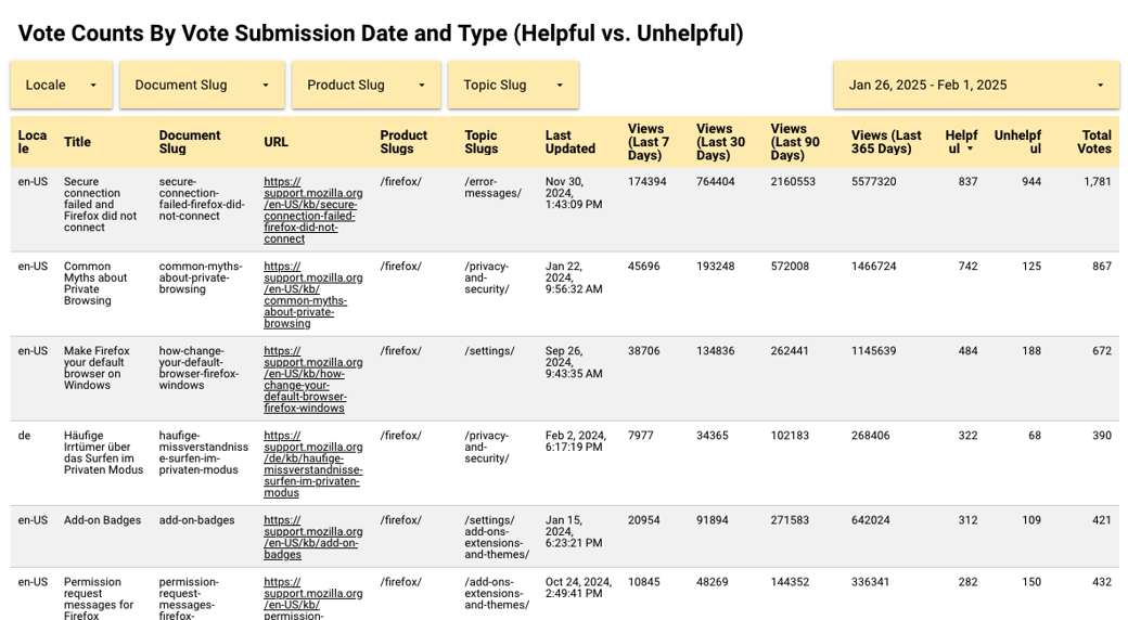
The existing version of the Helpfulness Survey was somewhat useful in gathering customer feedback about an article, but those signals were muddled due to a mixture of misplaced product feedback, support requests, and personally identifiable information (PII) included in submissions. Additionally, the dashboards that comprised the survey metrics were cumbersome to use and lacked many options to transition from broad overviews to more focused segments of data. These issues ultimately detracted from the value the survey provided and did little to inform the Content team’s workflows.
Solution
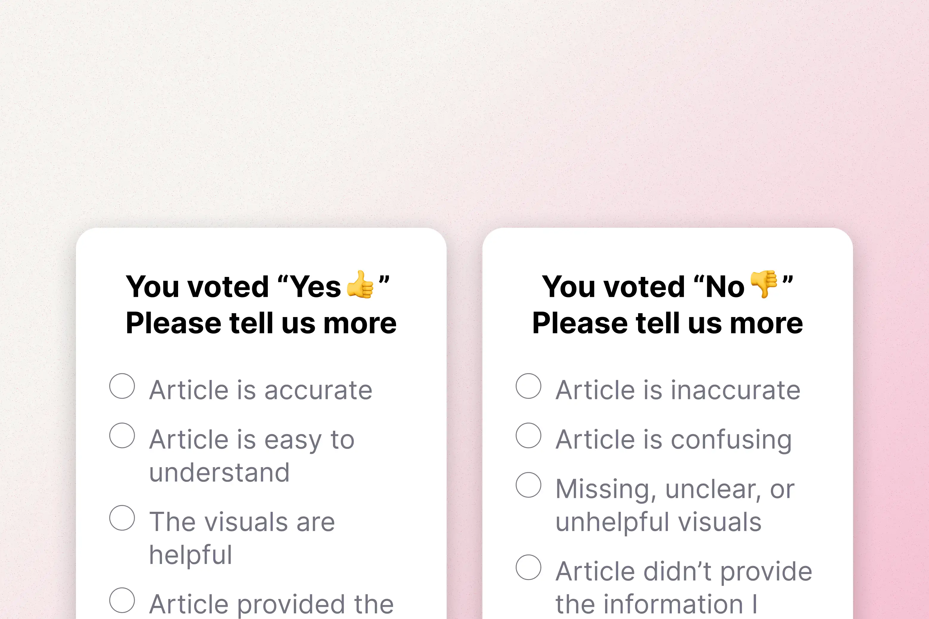
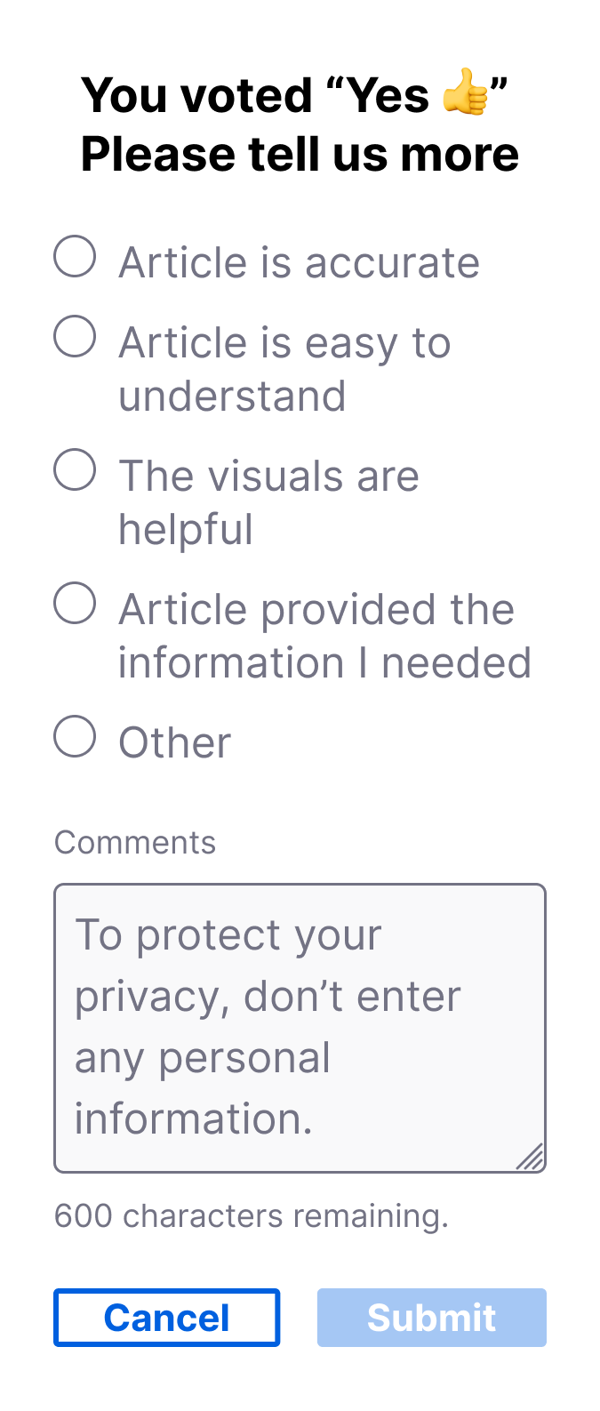
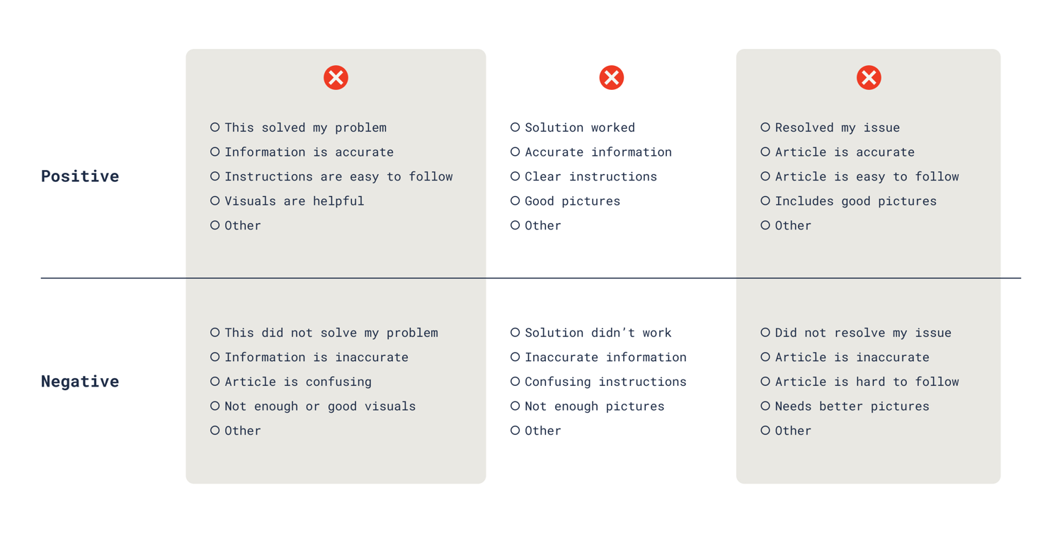
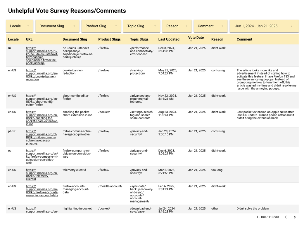
Intentional changes to the selectable feedback reasons focused on specific aspects of an article’s quality, like clarity, accuracy, and imagery. With these text updates my project team and I sought to provide the Content team with customer insights that were more actionable.
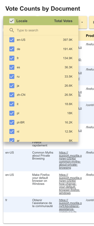
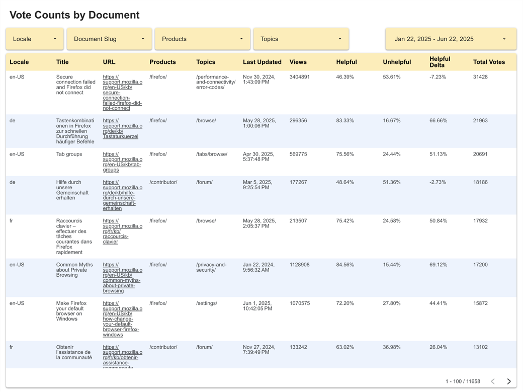
Additionally, the survey dashboards were updated to accommodate newly captured data. Improved filter and segmentation tools allowed the Content team to “change altitudes” more easily, from spotlighting the impact of changes to individual articles to widening the focus and identifying trends that coincided with product update releases.
Results
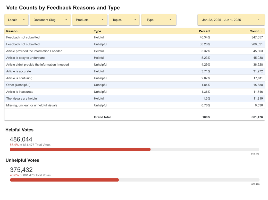
The new survey was launched in January of 2025 and though the majority of survey-takers did not submit a feedback reason for their helpful or unhelpful votes, 40.21% and 33.38% respectively, it revealed users were finding articles more helpful than not. Submissions with Article provided the information I needed clocked in at 5.34% (51,904 total submissions) and Article is easy to understand was the next most common reason at 5.2% (50,525 total submissions). Overall, around 25% of voters were including a reason with their vote, offering valuable content feedback, but this was down from 41% when the survey only had negative reasons. It was clear that there was an opportunity to iterate further in future versions of the survey. Some other positive outcomes we saw post-launch included:
Certain metrics tell different stories
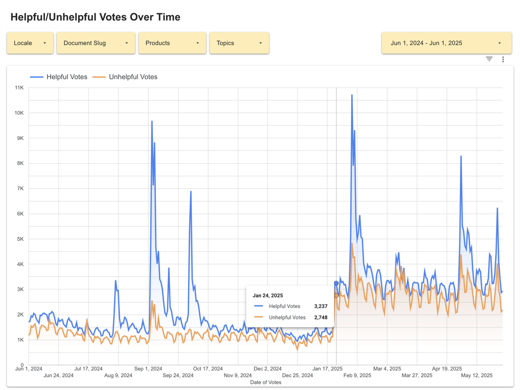
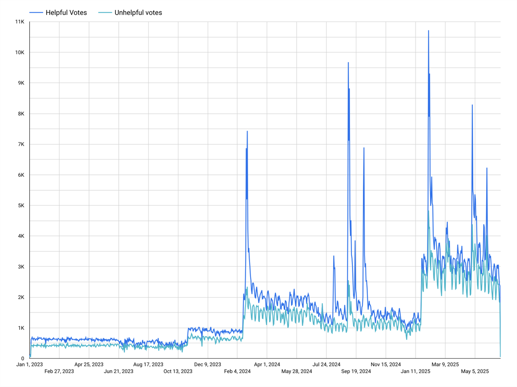
In order to get an understanding of our survey’s baseline performance, I did some digging in Google Analytics and found that between July 1st and November 1st (2024), Knowledge Base articles (across all locales) accounted for 76.94% of all page views on the support website.
In the same time span, there were 289,000 article_vote events recorded. Using these metrics, I calculated an overall engagement rate for the survey:
So, it’s not that the survey wasn’t getting any engagement, it just wasn’t a significant number. I put out an inquiry to other teams within Mozilla to get an idea of their experience with survey engagement rates. Discussing the topic with a manager on the Firefox Quantitative User Research team, I learned that form factor and context mattered a lot. In her experience, one question, in-product surveys had a higher opt-in rate than desktop surveys hosted on web pages. Meanwhile, click through on email surveys was generally very low, around a fraction of a percent.
I think your calculation is the obvious and correct one if you want to understand opt-in on a per article basis […] But a per-user vote will also help you understand what percent of visitors votes. Rosanne - Manager, Firefox Quantitative User Research
She suggested calculating the rate of votes per user to get a sense of their voting habits. If it was much higher than the per-article vote rate, that meant users might visit a lot of articles before voting on one or a few (theoretically on the one that finally answers their problem). If it was much lower that meant fewer users voted, but those who did, voted on many articles. Calculating the rate of votes per user from the same time span:
(Signal) Quality over (signal) quantity
My project team and I were interested in monitoring engagement rate but focusing solely on the number of overall votes wasn’t going to solve the core issues the Content team had with feedback gathered from survey submissions:
These issues meant only some of the data resulting from the current survey provided actionable insights. Our primary goal became improving the feedback options in step 2, after the initial Yes/No vote, so that the Content team could understand what specific parts of an article users found unhelpful and make informed decisions about changes. Consulting with stakeholders, I worked through several iterations of the feedback reasons so they focused on the quality and accuracy of an article’s content.
Adding a step 2 for the “helpful” vote path could provide insights into what was working, potentially validating content strategies, like the recent Cognitive Load Reduction project, and encouraging the team to apply the same approach to other articles with lower helpfulness scores.
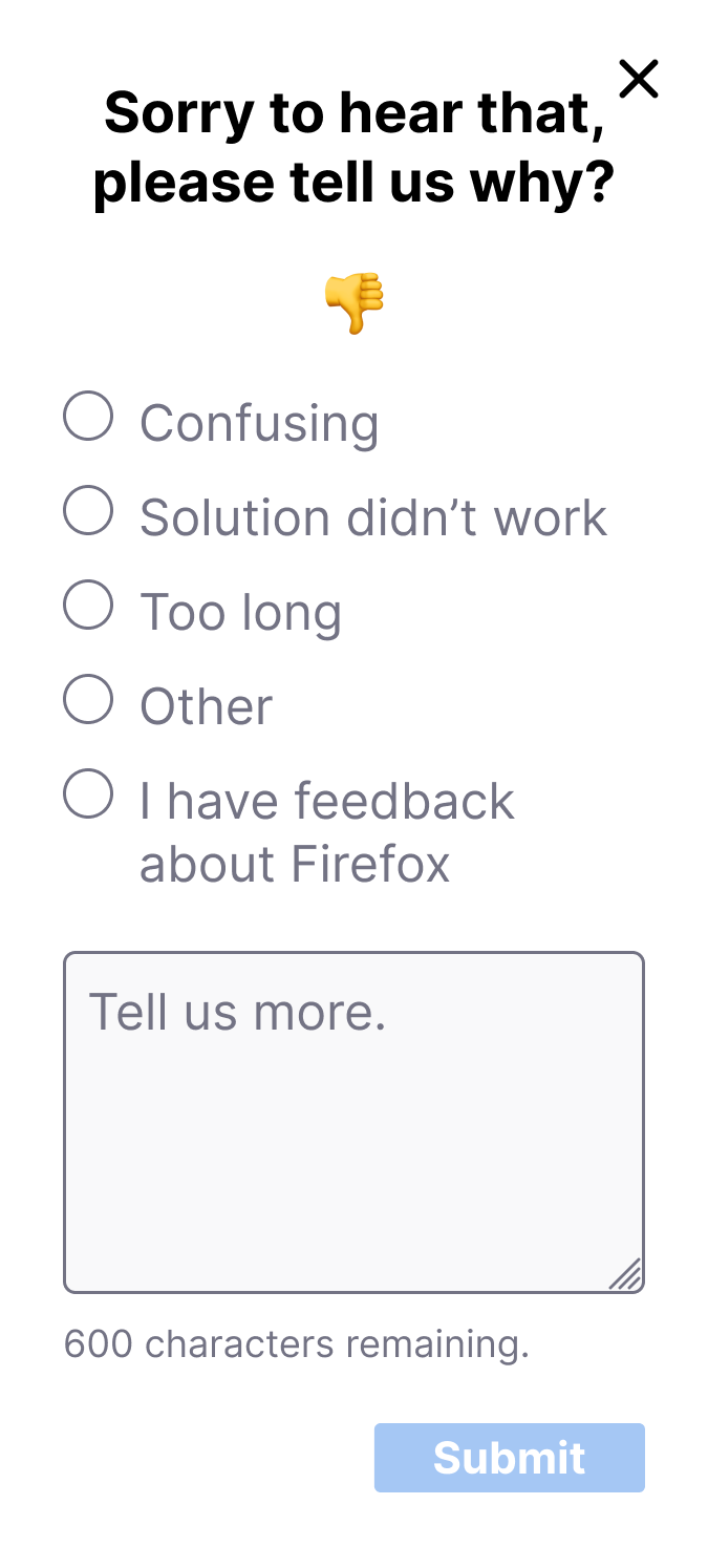
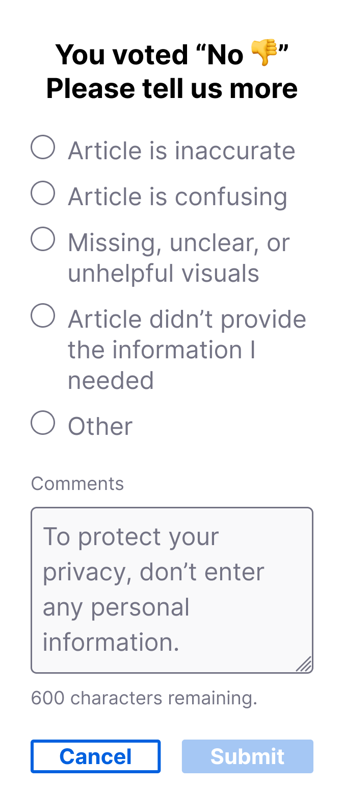
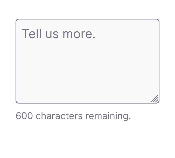
An optional comments text box field allowed users to include additional context when selecting an established reason, however, if a user selected Other this field became required in order to prevent feedback that was undefined. Additional changes to the UI to addressed the issue of PII and helped make the survey widget’s functionality a little more transparent.
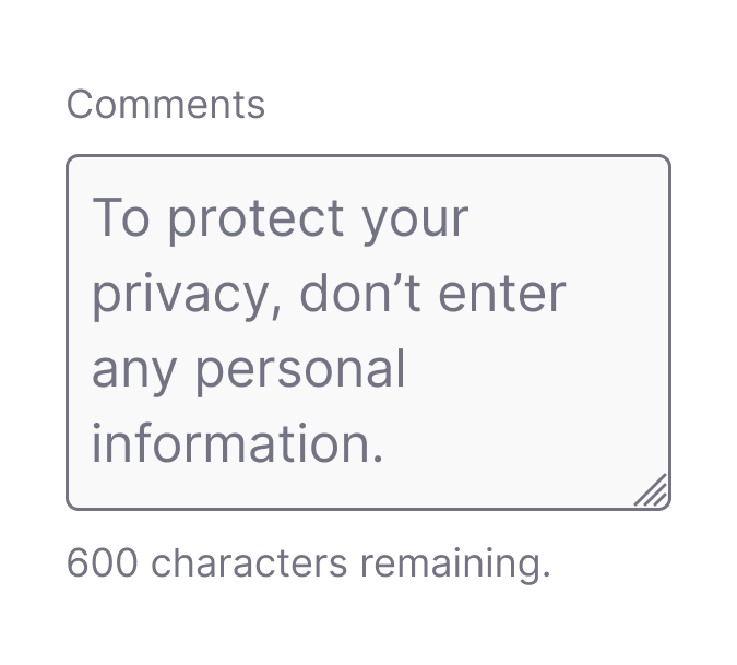
I updated the Comments input field placeholder text to discourage users from including their personal information in submissions.


I changed header text that appeared in step 2 of the survey to explicitly communicate to the user their initial Yes/No vote had been counted at this point.

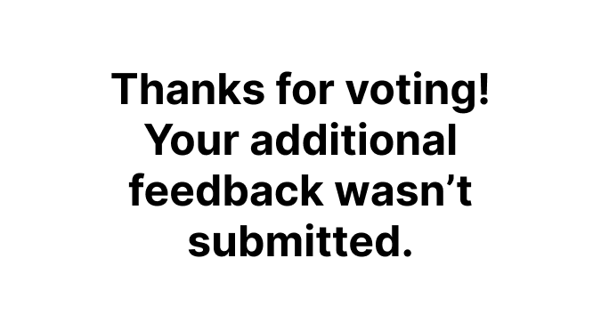

Lastly, I added an additional confirmation message to differentiate outcomes when users opt out of selecting a feedback reason in the second step.
More useful & usable dashboards
The existing dashboards provided a passable cross-section of the Knowledge Base, but the Content team wasn’t taking full advantage of their utility. Certain aspects like the available filtering tools made it cumbersome to focus on individual products, articles, or time frames, and with the changes to the survey’s feedback options, newly captured positive feedback still needed to be incorporated.
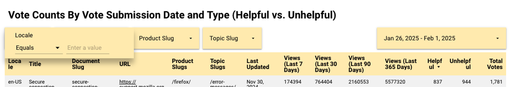
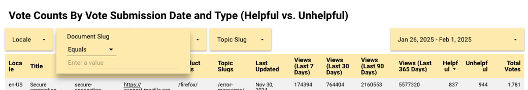
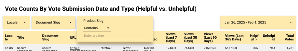
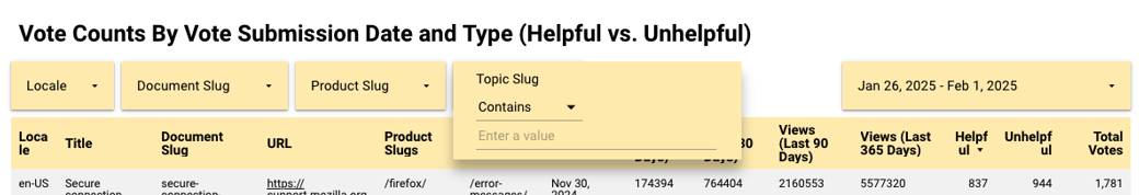
I worked with one of our platform engineers to revamp the survey’s dashboards, leveraging user stories I co-wrote with the manager of the Content team to target improvements that would have the most impact. Over the course of a week, we managed to achieve 8 out of 13 changes requested.
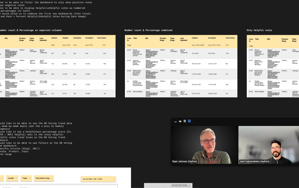
Understanding the pain points the Content team was experiencing with the existing dashboards taught me that the quality of the signals captured was only half the equation. Optimizing how they were aggregated and analyzed was just as important. Improvements to both the data and the dashboards meant Helpfulness metrics were more actionable and the Content team could explore how an article’s helpfulness score correlated to objectives like content freshness and support deflection.
Concusions & takeaways
In the months following the launch of the updated survey, I noted positive changes in the metrics we were tracking like the rate of votes per user, reducing PII, and survey engagement (though I’ve been unable to attribute this increase to any one thing). Beyond the numbers, there were several outcomes that pointed to the overall success of the project, including:
Our first iteration only consisted of changes to wording and the addition of positive feedback reasons, but there were still plenty of considerations for future versions of the survey like:
Looking forward, key takeaways from this project will inform strategies for implementing additional surveys on the support website to measure localization accuracy and customer effort with the broader goal of validating connections between content quality and customer satisfaction in our self-serve support strategies.